Does the snapped view required for Windows 8 apps provide insights into the future of Windows 8 and Windows Phone 8 development?
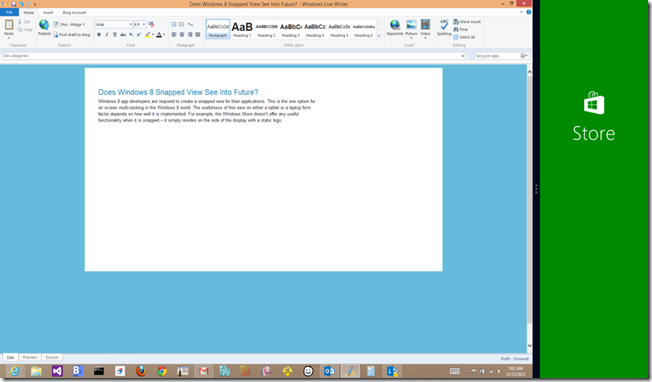
Windows 8 app developers are required to create a snapped view for their applications. This is the one option for on screen multi-tasking in the Windows 8 world. The usefulness of this view on either a tablet or a laptop form factor depends on how well it is implemented. For example, the Windows Store doesn’t offer any useful functionality when it is snapped – it simply resides on the side of the display with a static logo:
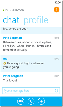
On the other hand, Skype provides fairly useful snap views when you are chatting, as shown below, or making phone calls. I can use the desktop to work on my “main task” while keeping an eye on the chat or having fast access to mute a call on the side.
This is fairly useful. In fact, I use Skype snapped all of the time – having the control on the side allows me to text (now that it integrates with Messenger) and also makes it easy to mute and unmute as needed. I couldn’t help but notice that the snapped view reminds me of the full-blown application on Windows Phone:
So what does that have to do with the snapped view? Well, I got to thinking – what does the Microsoft guidance say about snapped view? You can read the guidelines at MSDN.
The snapped view is fixed at 320 pixels wide. This is a width that can scale well to most phone resolutions – the Windows Phone 7 width was 480 and goes up from there. So setting this as a fixed width means it automatically fits in any Windows Phone screen. Here’s what’s even more interesting: the guidance for snapped is that "the snapped app is your app resized! It is not a gadget or a minimized window. You want to maintain state, context, and interactivity for your users. Snapping and unsnapping should never destroy the user's work or state.” That means the snap view should behave as a fully functional application.
At the very minimum, it seems that if you are targeting both Windows 8 and Windows Phone, then you have a point of parity that should be designed for: the snapped view. Shouldn’t the snapped view of your Windows 8 app behave pretty much the same as the full blown app on the phone form factor? There may be some nuances that you have to address (for example, the panorama control that works well on the phone isn’t necessarily available for the snapped view on Windows 8) but for the most part you are functioning in a similar form factor (while the strip goes “long” on large displays, this is easily a vertical scroll on the phone).
So then my next question is this: did Microsoft plan for this? Is the snapped view really just a convenient way to allow two apps to run side-by-side on Windows, or is it maybe a forward-looking approach to the eventual unification of the platforms? To me, it’s an interesting notion: if you write a Windows 8 app with a fully functional snapped view, couldn’t you potentially port that directly to the phone without changing a thing?
It’s an intriguing notion. Of course, it does have some flaws as well. For example, you can’t ignore the fact that a lot of the code and XAML for a given app will be focused on the full screen Windows 8 app experience, and that extra overhead makes no sense for the phone (it just takes up extra space that’s not needed). Then there is the issue with the 320 pixel width: modern phones support much higher resolutions, so the snap view could quickly become clunky and scaled on future phones.
So what to do?
My opinion is that the snapped view can provide the means to an approach for forward-thinking developers. The platform may or may not become fully unified in the future, but that doesn’t mean you don’t have the tools right now to build code in a way that takes advantage of both. Through the use of the Portable Class Library you can already share code between Windows 8 and Windows Phone 8. It seems that you could structure your application to take advantage of snapped view and overlap the majority of logic that targets the smaller form factors, then target the full screen Windows 8 view as a separate experience.
What do you think?


