Friday, December 21, 2012

The Mixed Bag of Windows 8 Chips

Ivy Bridge. Clover Tail. No, wait, Cloverview. ARM? Atom!

Understanding the processors that drive today’s tablets and laptops is definitely like wading through alphabet soup. If the fact that there are two versions of the latest Windows operating system (Windows 8 and Windows RT) isn’t confusing enough, there are literally dozens of CPUs available and most have an affinity to one OS version or the other. Oh, and by the way, you’ve probably heard that Windows RT runs on ARM processors, right? So why do the tablet processors have names like Tegra and Snapdragon?

First, let’s get some terminology out of the way.

  • Chip – a piece of silicon with an electronic circuit, and can also be referred to as a Microprocessor. Often used to describe components like the central processing unit (CPU) and graphics processing unit (GPU).
  • Chipset – an architecture that may include multiple chips designed to work together.
  • Instruction Set – this is the part of a processor that relates to programming and includes instructions for the processor to execute, registers for storing data, among other features.
  • Microarchitecture – describes how a given processor implements an instruction set.
  • Processor – a specialized chip that can interpret instruction sets and perform tasks. For example, most devices have a CPU (Central Processing Unit) and a GPU (Graphics Processing Unit).

A quick glance at popular Windows 8 models reveals quite the mix of processor technologies. Here’s a quick rundown:

Tablet Processor
Acer Aspire S7 Intel Core i5-3317U
Acer Iconia W510 Intel Atom Z2760
Acer Iconia W700 Intel Core i3-3217U
ASUS VivoTab RT NVIDIA Tegra 3
ASUS VivoTab Intel Atom Z2760
ASUS ZENBOOK UX31A Touch Intel Core i7-3517U
Dell XPS 10 Qualcomm Snapdragon S4
Dell XPS 12 Intel Core i7-3517U
HP ENVY x2 Intel Atom Z2760
Lenovo IdeaPad Yoga 11 NVIDIA Tegra 3
Lenovo IdeaPad Yoga 13 Intel Core i7-3517U
Lenovo ThinkPad Tablet 2 Intel Atom Z2760
Samsung ATIV Smart PC 500T Intel Atom Z2760
Samsung Series 5 Ultra 13 Touch Intel Core i3-3217U
Surface with Windows RT NVIDIA Tegra 3

That is by no means a comprehensive list but it does show a cross-section of chips you may encounter when searching for a portable Windows 8 device. The first step in understanding what the processors are is to take a look at the following chart. This is my attempt to lay out the processors in a “map” to show the hierarchy:

chipsets

It’s interesting to note that the ARM chips are “white-labeled” with other companies. This is because they plug into an SoC, or “system-on-a-chip” architecture that allows for multiple components to be integrated onto a single chip. The ARM architecture is an instruction set architecture that is integrated with other components such as the graphics processing unit (GPU) to provide a low-voltage, high performance experience. All of the chips to the right of the diagram use an ARM-based SoC architecture and only run Windows RT. To the left of the diagram, all of the Intel processors (including Atom) will run the full version of Windows 8. Atom is the SoC offering from Intel.

Code Names

You’ll hear quite a view code names for processors. The first two are easy: Snapdragon and Tegra are brands of SoC chips that are based on the ARM instruction set. They are specific implementations of those chips and tablets that use these chips run various devices and operating systems including Windows RT.

The Intel SoC platform was codenamed Clover Trail (the chipset is Cloverview) and is now mostly referred to by the actual name, the Intel Atom (and as far as I can tell, the Z2760 is the only one out right now). Intel produced a series of chipset versions that handled low voltage (you’ll read about that in a bit) and then developed an even lower voltage set for Atom. Unfortunately, Atom-based tablets are experiencing some delays due to difficulties with drivers.  The advantage of the ARM-based and Intel Atom processors is that they run cool, eliminating the need for a fan. This allows for an extremely small/thin form factor, and tablets and laptops that use these chips are the thinnest available. My ASUS VivoTab RT is only 8.3 millimeters thick and weighs only 1.16 pounds. Compare that to the iPad3 at 9.4 millimeters thick and 1.43 pounds.

Next you can cross two bridges: Ivy Bridge and Sandy Bridge. These names may be confusing because they don’t refer to a specific processor, but a microarchitecture used by Intel to manufacture their chips. You might see processors listed as “2nd generation” or “3rd generation” Intel processors (all of the new ones are 3rd generation). The 2nd generation was codenamed Sandy Bridge, and the 3rd generation or current batch is called Ivy Bridge. Ivy Bridge is actually based on the Sandy Bridge architecture, but provides a smaller chip, lower voltage and hence less power usage, improved graphics and slightly faster processing speeds. Any i3, i5, or i7 chip you see in a portable device is likely a Sandy Bridge.

The Sandy Bridge family is “branded” as the Core series. This includes the Core i3, Core i5, and Core i7.

Getting to the Core

So what is the difference? First, you’ll notice that the specific sequence of each chip listed above includes a “U” at the end. This is simply the designation from Intel for a lower voltage version of the chip. While it sacrifices a bit of performance compared to desktop counterparts, it makes sense for a laptop, ultrabook, slate, or tablet form factor because of the lower power consumption. The difference between series numbers is more complicated but as you might expect, “more is better” in this case, i.e. you’ll likely see advantages to using a Core i7 over a Core i5.

Core i3

This is the budget or entry-level family. It is a dual-core chip that lacks a feature called Turbo Boost that allows the chip to overclock at a faster rate. It does have hyper-threading, a technology that allows a physical core to appear as two logical cores. This means the i3 supports four simultaneous threads. The 3217U clocks at 1.8 GHz.

Core i5

Ironically, the i5 does not support hyper-threading. The chip itself comes as a quad-core, however, so you still get four threads and these are physical, not logical, threads. While the clock speed for the i5 might be listed as 1.7 GHz it is capable of overclocking to 2.6 GHz.

Core i7

The i7 is very similar to the i5 but adds hyper-threading back to the mix. Therefore, this quad-core chip supports up to eight simultaneous threads. It’s important to note that unless software is written to specifically take advantage of multi-threading, this doesn’t necessarily add any benefit and may not justify the expense over the Core i5. It is faster, with a base of 2.0 GHz that can overclock to 3.2 GHz.

The Atom Formerly Known as Clover Trail

The Atom processor is the Intel SoC offering that some say could make ARM obsolete. It runs x86, clocks at 1.8 GHz (the same as the Core i3), supports up to 2 GB of memory and supports hyper-threading. According to Intel, it benchmarks faster than the NVIDIA Tegra 3 and Qualcomm Snapdragon S4. Basically it is a lower performing Intel chipset with the advantage that it consumes less power (making it ideal for thin form factors such as tablets and ultrabooks) and runs the full x86 chipset (allowing it to run the full Windows 8 versions and provide support for legacy Windows 7 and Windows XP applications).

ARM Yourself

The last set of chips follow the ARM instruction set. This is a completely different architecture than the Intel chipsets provide, so it is not compatible with the millions of lines of legacy code that was compiled to target x86 and x64 (32-bit and 64-bit Intel) systems. ARM licenses the instruction set architecture so other companies like NVIDIA and Qualcomm then provide their own chips. In addition to allowing for extremely low voltage implementations, ARM does provide a few advantages over the x86 instruction set that Intel processors use.

For example, the Intel chips take complicated x86 instructions and “decode” them into simpler, smaller instruction sets for the chip to follow. The ARM is streamlined to avoid the need for this approach. The x86 set relies heavily on branching logic (perform an operation, then branch based on the result). In the ARM instruction set, every instruction is conditional so if-then-else operations can be handled without branching.

ARM processors are used heavily in smart phones, disk drives, and set top devices. There are several builds of Linux, including Android, that support the ARM architecture, and Microsoft recently released the Windows RT OS specifically to provide ARM support. To make things even more confusing, chip maker AMD which produces, among other things, x86-based chipsets announced it will be integrating ARM technology with its chips.

Summary

As you can see, there are quite a few options when shopping for a mobile device. Initially, it appeared the ultra-light, ultra-thin form factors would all run the more limited Windows RT OS on ARM architectures, but Intel’s introduction of the Atom processor may change the game. I believe we’ll see a plethora of devices “mature” in the Windows 8 space by the 2nd quarter of 2013 but if you insist on purchasing a device now, understanding the chipset will help you make a more informed decision. I plan to have two devices until the low voltage Intel-based chips can support a true development environment: an ARM-based device for travel and portability, and a Core i7 for my workstation.

Wednesday, December 19, 2012

The Future of Windows 8 and Windows Phone 8 Development

Does the snapped view required for Windows 8 apps provide insights into the future of Windows 8 and Windows Phone 8 development?

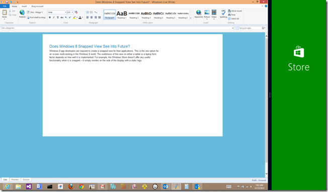
Windows 8 app developers are required to create a snapped view for their applications. This is the one option for on screen multi-tasking in the Windows 8 world. The usefulness of this view on either a tablet or a laptop form factor depends on how well it is implemented. For example, the Windows Store doesn’t offer any useful functionality when it is snapped – it simply resides on the side of the display with a static logo:

storesnapped

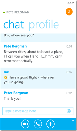
On the other hand, Skype provides fairly useful snap views when you are chatting, as shown below, or making phone calls. I can use the desktop to work on my “main task” while keeping an eye on the chat or having fast access to mute a call on the side.

skypesnap

This is fairly useful. In fact, I use Skype snapped all of the time – having the control on the side allows me to text (now that it integrates with Messenger) and also makes it easy to mute and unmute as needed. I couldn’t help but notice that the snapped view reminds me of the full-blown application on Windows Phone:

skypephone

So what does that have to do with the snapped view? Well, I got to thinking – what does the Microsoft guidance say about snapped view? You can read the guidelines at MSDN.

The snapped view is fixed at 320 pixels wide. This is a width that can scale well to most phone resolutions – the Windows Phone 7 width was 480 and goes up from there. So setting this as a fixed width means it automatically fits in any Windows Phone screen. Here’s what’s even more interesting: the guidance for snapped is that "the snapped app is your app resized! It is not a gadget or a minimized window. You want to maintain state, context, and interactivity for your users. Snapping and unsnapping should never destroy the user's work or state.” That means the snap view should behave as a fully functional application.

At the very minimum, it seems that if you are targeting both Windows 8 and Windows Phone, then you have a point of parity that should be designed for: the snapped view. Shouldn’t the snapped view of your Windows 8 app behave pretty much the same as the full blown app on the phone form factor? There may be some nuances that you have to address (for example, the panorama control that works well on the phone isn’t necessarily available for the snapped view on Windows 8) but for the most part you are functioning in a similar form factor (while the strip goes “long” on large displays, this is easily a vertical scroll on the phone).

So then my next question is this: did Microsoft plan for this? Is the snapped view really just a convenient way to allow two apps to run side-by-side on Windows, or is it maybe a forward-looking approach to the eventual unification of the platforms? To me, it’s an interesting notion: if you write a Windows 8 app with a fully functional snapped view, couldn’t you potentially port that directly to the phone without changing a thing?

It’s an intriguing notion. Of course, it does have some flaws as well. For example, you can’t ignore the fact that a lot of the code and XAML for a given app will be focused on the full screen Windows 8 app experience, and that extra overhead makes no sense for the phone (it just takes up extra space that’s not needed). Then there is the issue with the 320 pixel width: modern phones support much higher resolutions, so the snap view could quickly become clunky and scaled on future phones.

So what to do?

My opinion is that the snapped view can provide the means to an approach for forward-thinking developers. The platform may or may not become fully unified in the future, but that doesn’t mean you don’t have the tools right now to build code in a way that takes advantage of both. Through the use of the Portable Class Library you can already share code between Windows 8 and Windows Phone 8. It seems that you could structure your application to take advantage of snapped view and overlap the majority of logic that targets the smaller form factors, then target the full screen Windows 8 view as a separate experience.

What do you think?

Monday, December 17, 2012

ASUS VivoTab RT Review

I recently purchased an ASUS VivoTab RT (the TF600 SKU, 32 GB of storage). As it is one of the less popular WindowsRT models I wanted to write a short review to explain why I made the purchase and how it is working out.

Why Get a WindowsRT Device?

The first question is, of course, “Why?” There are several reasons I decided to pick up this particular device. After using a Samsung Series 7 Slate running Windows 8 for over a year now, I’ve come to realize that we are not yet in a “one device” world. While there are a number of exciting new hybrid and convertible tablets, I’ve watched my own usage of an arguably “business ready” slate (capable of writing chapters, developing, and compiling production code as I did for my Building Windows 8 Apps Book) I really … just … don’t use it that way. Even my bulky Dell Latitude E6510 ends up serving me mostly when it’s in the docking station so I have my large screen monitors and external keyboard and mouse. This is where I do my “productivity” work or engage in business use. That’s tasks like image editing, developing code, and heavy writing (ironically, there is just one app that we need on WindowsRT to shift the bulk of writing over, as I’ll explain in a bit).

Based on this, I came to the realization that I don’t need a device with lots of storage or processing power for my tablet. In fact, I don’t really want it. I’ve had a tablet capable of running those power apps I’m used to from Windows 7 and while I installed them and tinkered with them, I’m almost exclusively running Windows 8 apps. The tablet is absolutely for casual use. That includes casual writing, productive browsing (I can do a lot with web-based apps using Internet Explorer 10), watching movies, and checking and responding to email. If I can eke out just a few more tasks like going into Word, Excel, and PowerPoint, then it’s also good for portability. When I take short business trips or long vacations, I’d much rather lug around a light tablet than a heavy business laptop.

While I know I can run those fancy x86 apps using an Atom processor, I really don’t see the need to go outside of ARM. So for me, WindowsRT is a fine choice for one of two machines I’ll use. I’m not trying to make it my “main" machine.” I understand consumers can get confused about the choice, but I’d also argue many consumers will do just fine with what WindowsRT provides. I like to think of it as “that Windows 8 version that really only runs Windows 8 apps and Office.” I know that’s oversimplifying, but this is precisely what I use it for.

So then the next logical question is, “Why the ASUS VivoTab? Why not a Surface?” Let me preface by saying I love the Surface. It’s an amazing piece of hardware. I love what they did with the keyboard and how even the touch keyboard responds so nicely and provides a very usable experience. There are some issues, however. The kickstand works great in commercials with students slapping it on flat surfaces, but what about propped up on my chest when I’m on the couch watching a movie? The kickstand really doesn’t do much for that … whereas the Samsung had a hard case I could arrange in a “tent mode”. Besides, a lot of people are picking up the Surface so I was interested in trying out some other form factors.

There was another practical reason. For the follow on book to my first one – a more in-depth volume that covers the Windows Runtime in advanced detail – I’ll need to write sample code and demonstrate the use of sensors. It turns out that the ASUS VivoTab has two that the Surface does not: GPS (and I mean freaky good GPS, as in “the blue dot is literally showing the room of my house I’m in” good) and NFC. While I could get devices to hook externally to test these, I liked that they come with the ASUS right out of the box.

Here’s me testing the accelerometer:

accelerometer

The Buying Experience

My experience picking one up wasn’t too bad. I started by reading reviews and narrowing the field, then looking at prices. It turns out there is a great special and ASUS will throw in the keyboard dock for free when you order before 2013. I can’t imagine reviewing this device without the dock. It serves as a stabilizer (yes, I can rest it on my lap on the couch because it’s a firm dock with the keyboard) but also extends the battery life. I’m thinking “constant use on overseas flights.” It makes it into a nice little folding laptop.

I wanted to try out several machines (remember, I’m in the market for two … this is my casual/portable one but I’m looking for the main business-case one to use as well) so I drove to Best Buy first. They had two models on display. If I was an average consumer, I’d have stopped right there. These devices had been literally touched to death (salespeople, how about wiping them clean every once in awhile?). The touch was non-responsive – I couldn’t even get the Charms bar to show! That was both devices. They had so much crap running that trying to tap a tile or multitask was taking forever. My heart sank … no way I could use this … but it still seemed strange that none of those problems were discussed in any of the reviews I read or hands-on videos I watched.

It was funny hearing the sales representatives talk to customers. There was a huge gathering of people trying out Windows devices. Surface was in high demand, only the message was, “Wait.” Over and over I’d watch someone pick up the Surface and start to play with it, seem pleasantly surprised, then call over an assistant only to be told, “You don’t want to buy that. The Pro is coming out soon, that’s what you want.” Not, “What do you need?” or “What are you looking for?” but simply, “Wait.” No wonder sales aren’t that great, and I don’t think Best Buy is going to up those much if that is the message they were rolling out.

Instead of giving up, I made a few calls and located an Office Depot that had the model in stock. I drove there and was able to use that device. I really enjoyed it. The touch worked fine, it was super responsive, and I had no issues. Maybe I should be concerned about future wear and tear based on the Best Buy experience, but I suspect their tablets may have been abused slightly more than what mine will go through. Anyway, I was sold right there. I told the cashier what I wanted, and laughed when the reply was, “Um, sir, you know that’s a WindowsRT device, right? Are you SURE you want to buy that?” “Yes, please, let me give you my money.” They caved in and allowed me to purchase it. It was nice to get it from a store because I saved shipping, got to try the device out, and they honored the free keyboard right there (no rebates or mail-ins, just a second box to go with my new tablet).

The Build Quality

I got home and unboxed and was incredibly impressed with the device. I’m not one to go into heavy detail with the “unboxing experience” but ASUS really did a great job of packing it. When I picked up my first iPhone it felt like getting a piece of jewelry in a velvet box and this experience was no different. It’s in a nice, professional looking black box with a padded inside and crisp, tight presentation (the documents come enclosed in a glossy black cardboard box and everything is tightly packed and wrapped in plastic). The slate itself is incredibly thin and light. Here’s one of my not-so-professional pictures holding it from the side:

I love the rounded corners. The back has a brushed metal appearance and texture that just feels firm and sturdy. It is really easy to grip in both hands or with a single hand as needed. All of the outlets are well-positioned. I personally like that the thickness was not compromised for USB. Instead, you can use a dongle to bridge USB into the super-thin slot that serves as the power outlet. Once you get the hang of the volume rocker (it is tilted slightly so you have to press behind the device) it also makes perfect sense.

The first complaint I have is the power cord itself. It seemed simple and easy enough to plug in, but when I tried to pull it out the first time, the plastic sleeve literally started to come out while the internal connector remained snugly attached. I pushed the plastic down and gripped it farther back and it disengaged fine. There doesn’t appear to be any damage and I’ve used it several times for both the slate and keyboard dock. Ironically, even though I now know I have to grip it a certain way to remove it, when it is seated it appears to be slightly loose. I found myself checking the power indicator a few times to convince myself it was OK.

The keyboard is also impressive. I like the overall look and feel:

There are keys for about anything you’d like to do, but doing it is another story. While they have good travel and nice, chicklet-style feedback, they are also very cramped. While I can type quickly it takes some getting used to. The backspace button feels really small and out of place, and sometimes I found myself struggling to use the shift key in combination with a character. It is usable and I noticed that I was getting better with practice, but even the similarly sized Bluetooth keyboard I got with my Samsung feels more functional and productive.

I’ve heard some complaints about the track pad but I really enjoy it. It seems responsive and well calibrated in my opinion, and I found myself using it easily with a single finger or thumb while the tablet is docked. Using a single touch it works like you would expect as a replacement for a mouse pointer. Use two fingers, however, and you get gesture support. The main advantage here is that you can scroll as if you are swiping the screen. This works both horizontally and vertically, and I use it a bit. It is super sensitive, which I like because I can zoom through a list quickly and get to where I want to go – no more awkward scrollbar dragging or clicking to scroll.

The dock itself is sturdy. I consider it an advantage because I can set it down on my lap or on other unstable surfaces and still view the screen in an angle I desire. The docking experience itself is a little unsettling. While it does vibrate when turned on to indicate a successful dock, I find myself pressing a bit hard and worrying about damaging the ports if I’m not aligned. There isn’t a satisfying click when it snaps into place, so if you aren’t powered on you have to guess – you only get the vibration when you are powered on. Undocking it requires pressing a lever on the side to release it and pulling it up. The slate doesn’t detach easily and again I find myself worrying about damaging the unit.

Once docked, however, it works great as a miniature laptop. The hinge is hidden in a clamshell design and you can angle the display with a good degree of freedom and even close the “lid” to make it hibernate. I find this to be the easiest way to carry it around without worrying about the screen. Even with the keyboard it’s very light (less than 3 pounds) but the added bonus is battery life. I haven’t had a chance to run it down but the manufacturer states up to 19 hours and reviewers are saying around 15 hours of life when it is docked. That’s huge, and it’s done without any large or heavy batteries. This is a truly innovative design in my opinion and will come in handy when heading overseas. In the following snapshot, I’m not running a Commodore 64 emulator – it’s just the background I use to confuse strangers and start interesting conversations with other nostalgic 6502 hackers.

The speakers are built into the back of the slate and have a very clear, crisp sound. I started off the day this morning by loading up a Christmas station and playing Christmas songs. The built-in volume is plenty to hear throughout the house. The audio out is also crisp and clear and sounds great in my headphones.

The screen is only 1366 x 768 but it works – plenty of pixel density for a 10.1” screen. The display is incredibly bright and crisp. I tried several different modes, between working with applications, playing games, watching movies and reading books in the Kindle app. All modes worked great and are far more crisp and clear than what I’m used to (and no, I’m not an iPad user so I understand that may be old hat for some). Full screen video worked flawlessly (I tested Netflix streaming and local video at full screen).

Usability

So the most important part of the review is … how usable is it? If you’re not familiar with the Windows Store, it provides a nice feature that keeps all of your apps in a single location regardless of what device you are using if you sign in with a Windows Account. That makes it easy to find apps that I purchased or downloaded on my other devices and quickly install them on the new device. Some of the apps that came with it:

Built-in Mail

This comes “as is.” While it does not provide a version of Outlook in the preview, I really don’t care. I won’t use this for heavy business mail and it is perfectly fine for browsing and reading mails. I wired in all of my accounts easily (from Office 365 to Gmail and Live) and it ran fine.

People

The people hub picked up my social connections automatically through my Windows Account and works fine. Unfortunately, since the TweetRo debacle I haven’t found a good Twitter client for Windows 8. TweetRo has the features I want so this may just be the reason I’ve been looking for to slap down $9.99 for the pro version. I tried Rowi (don’t like the interface) and MetroTwit (kept crashing on me) so I’m a little stuck on that respect. The People Hub works fine for quick glances and notifications but I don’t consider it a replacement for the better native software we’ve all grown accustomed to.

Office

It is exciting to me that Office is available for this device. To me, that’s a key differentiator between WindowsRT and iOS devices. It’s not just the ability to view and work with Office documents, but to have a fully functional suite that allows you to create, edit, and consume them. The apps appear to work great – I opened several different types of documents. There were a few hiccups, however, that it is important to share.

The first happened when I opened a contract that had form fields and tried to print it to the native printer driver that was auto-recognized. My HP Office Jet Pro 8500 A910 was found automatically. The driver was not too happy, however, and I kept spitting out errors when I tried to print to it. I’d get a dialog telling me “the selection is invalid” that would keep popping up when dismissed and forced me to close the application through the Task Manager. I joined my Homegroup and the same printer showed up as a share from my Windows 8 laptop. Printing through the share worked fine and had no issues, so I’m not sure why the direct print had problems.

Asus Software

Asus adds some software that is surprisingly usable. There’s a connector to their WebStorage service that gives me 5 GB of extra space, a dictionary, a special camera app with built-in effects, a note-taking product (looks good but I’ll stick to OneNote), and a “fun center” that appears to feature various types of radio stations – I listened to a few and enjoyed them although the interface was terrible. Kindle was pre-installed and works well on the tablet and with the sharp, bright display is very readable even in direct sunlight.

Stuff I Installed 

The Google Search app is a must-have. It has great voice recognition and does a pretty good job of figuring out what you are asking for. I used it to test the built-in microphone and it scanned my voice with no problems. I installed Bank of America to stay on top of my accounts (I love being able to deposit checks by taking pictures from my home office) and Lync to stay connected with my business. Slacker Radio is a personal radio station that I enjoy and has channels that I can customize and listen to that I can’t find on iHeartRadio (which I also use).

Of course, I threw in a mess of games from Minesweeper and Solitaire to Card Games Chest (a cool game that has Crazy 8s and an Uno knock-off). I installed LastPass (it’s built-in browser is usable, but when push comes to shove I use the desktop browser and flip over to LastPass to cut/paste passwords for key sites).

For keeping up with news I use Nextgen Reader which works just as well on the ASUS as it did on my Samsung slate. Netflix is a must-have. I spend a few hours watching Battlestar Gallactica rebooted episodes in full screen. The image was crisp and clear with no stutter and the audio quality sounded even better than on the Samsung.

Xbox SmartGlass is always fun to cut in when my daughter is watching a movie and randomly pause it from the next room. Skype installed and I made a call to my wife’s cell phone. She heard me loud and clear. I haven’t tested video conferencing with Skype yet but I tested the video camera and it works fine.

I installed NovaMind’s Mind Map software. It is built really well for the slate experience. I used it to create a mind map for writing this article, and printed it out to use as a reference.

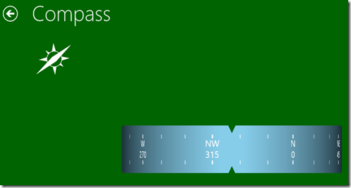
The last thing I installed was Jack of Tools to test out the various sensors. I found the accelerometer, GPS, and compass all work well. I see the ambient light sensor kicking on as well, but that particular app flags it as “not available.”
compass

Usability Summary

Overall I was worried that with an ARM processor and 2 GB of memory that I’d struggle using these applications. Maybe I haven’t had it long enough, but that simply wasn’t the case. Everything was fast and responsive and worked well, including heavy video, audio, and graphics. I really haven’t found anything yet that feels like it runs more slowly on this device. Perhaps that is one of the powerful benefits of the lifetime model that Windows 8 apps follow – they allow the foreground app to retain the majority of resources and only run things in the background that make sense like audio (who wants to lose their favorite jingle when they switch away from the music app to play games?)

The touch is responsive and snappy, the touch pad does everything I need it to, and while my fingers fumble over each other on the small keyboard it can get the job done. As I wrote earlier, I haven’t tried to drain the battery but I spent several hours browsing mail, watching videos, printing documents and surfing the web and the battery didn’t look like it drained even a bit.

Complaints

I do have some complaints. You’ve already heard about my issues with the keyboard design and the power cord. Another complaint is the lack of stylus support. While my finger works fine in some cases, the stylus provides extra precision where touch and the touch pad fall short. There may be certain pens that work with the display but I don’t own any and am not aware of any.

I’ve read that the WiFi might be sub-par but I don’t see that in my tests. I have an 802.11n router and my laptop regularly clocks 25 Mbps download and 8 Mbps upload speeds. The same test on my ASUS tablet yielded 25 Mbps down and 4 Mbps. These are the same results I get on my Samsung Series 7 slate. The signal does drop a bit more with distance compared to the slate and laptop I own, and I don’t believe the VivoTab supports 5 GHz wireless.

The other issues I had are related to WindowsRT and not specific to the ASUS (I would have these same issues on a Surface). The Office suite is a preview and it shows – there are definitely some features that behave differently and are less stable than the RTM version that runs on x86 machines. Homegroup is a selfish experience on WindowsRT. You can join and tap into the network, but you can’t share your own libraries (you can take it in but you can’t dish it out).

None of these complaints is major, but there is one problem that does annoy me with WindowsRT. There is no decent blogging software. I tried using the blog feature in Word only to have it choke on my Blogger credentials and tell me I couldn’t use their picture provider, whatever that means. It wasn’t usable.

I would love to be able to start a draft of a blog post using LiveWriter on my slate, fill in major ideas or notes, then pull it up on the full laptop to fill in images or do heavy editing. Unfortunately, that simply isn’t possible at the moment. Instead, I settled with laying out my thoughts using the mind map software, printing it from the slate and then heading back over to the laptop to run LiveWriter. If I could get a workable version of LiveWriter on this machine I could say it does everything I want it to.

Bottom Line

Bottom line? I think this is a terrific device. It is lighter than the iPad but still feels firm and projects a sense of precision and high quality engineering. I prefer the clam shell docking design over the Bluetooth option, and the battery life simply can’t be beat. With a crisp, clear display, highly responsive touch, and the built-in apps that address most of the things I want to do like watch videos and play music, I would already consider this an iPad contender. Add to that fully functional copies of Word, Excel, PowerPoint, and OneNote, and I consider it a winner.

Friday, December 7, 2012

Going Old School on Windows 8

The other day I was browsing some archives on an old disk drive and came across the T64 formatted binaries of some demo software I wrote for the Commodore 64 in the 1980s. Demo software is fun to write and is more about tricks and optimizations than business rules or data models. I had written a few fun projects in Silverlight a few years back and decided to convert some over to Windows 8. This particular project involved using a plane projection on six different rectangles to provide the illusion of a cube (it is an illusion because it’s not true 3D rendering, but instead the manipulation of the rectangles to give the illusion of a 3D construct). This was overlaid on a classic sine-based plasma field.

SplashScreen

Once again, I was amazed at how quickly and easily I was able to port the code over to Windows 8. Essentially, the only real work was changing the implementation of the plasma effect because the older version was able to manipulate pixels directly in the bitmap object, whereas in Windows 8 this must be done in a buffer and transferred over. By no means is this code optimized and efficient – you’ll certainly see the CPU spike – but it’s a neat and fun effect to watch and coding it was a nice break from typical line of business work.

The first step was creating the cube. A style defines the properties of a “side”:

<Style TargetType="Rectangle">
    <Setter Property="Margin" Value="170,50"/>
    <Setter Property="Height" Value="150"/>
    <Setter Property="Width" Value="150"/>
    <Setter Property="Opacity" Value
="0.5"/>
</
Style
>

Next, the sides are positioned to simulate the actual surface of a cube – here are just two of the six sides as an example. Note two sides are wrapped in the grid to facilitate the necessarily transformations to project properly:

<Rectangle Fill="Orange">
        <Rectangle.Projection>
            <PlaneProjection x:Name="Rectangle4Projection" 
CenterOfRotationZ
="-75" RotationX="90"/>
        </Rectangle.Projection
>
</
Rectangle
>
<
Grid Margin="170,50">
    <Grid.Projection>
        <PlaneProjection x:Name="Rectangle5Projection" 
CenterOfRotationZ
="-75" RotationY="-90"/>
    </Grid.Projection>
    <Rectangle Margin="0" Fill="Yellow" RenderTransformOrigin="0.5,0.5">
        <Rectangle.RenderTransform>
            <TransformGroup>
                <ScaleTransform/>
                <SkewTransform/>
                <RotateTransform x:Name="Rectangle5Rotation" Angle="0"/>
                <TranslateTransform/>
            </TransformGroup>
        </Rectangle.RenderTransform>
    </Rectangle
>
</
Grid
>

With the sides in place, the control itself wires into two events. The first event, the CompositionTarget.Rendering event, fires each time a frame is rendered for the application. This is one way to handle animations by “cheating” on the render loop rather than depending on a dispatcher timer. It also means the cube will move at different rates based on the speed of your machine. That event is used to update the projections for the sides:

private void CompositionTargetRendering(object sender, object e)
{
   
this.Rectangle1Projection.RotationY += ((this.pt.X - (this.LayoutRoot.ActualWidth / 2)) / this
.LayoutRoot.ActualWidth) * 10;
   
this.Rectangle2Projection.RotationY += ((this.pt.X - (this.LayoutRoot.ActualWidth / 2)) / this
.LayoutRoot.ActualWidth) * 10;
   
this.Rectangle3Projection.RotationY += ((this.pt.X - (this.LayoutRoot.ActualWidth / 2)) / this
.LayoutRoot.ActualWidth) * 10;
   
this.Rectangle4Projection.RotationY += ((this.pt.X - (this.LayoutRoot.ActualWidth / 2)) / this
.LayoutRoot.ActualWidth) * 10;
   
this.Rectangle5Projection.RotationY += ((this.pt.X - (this.LayoutRoot.ActualWidth / 2)) / this
.LayoutRoot.ActualWidth) * 10;
   
this.Rectangle6Projection.RotationY += ((this.pt.X - (this.LayoutRoot.ActualWidth / 2)) / this
.LayoutRoot.ActualWidth) * 10;
   
this.Rectangle1Projection.RotationX += ((this.pt.Y - (this.LayoutRoot.ActualHeight / 2)) / this
.LayoutRoot.ActualHeight) * 10;
   
this.Rectangle2Projection.RotationX += ((this.pt.Y - (this.LayoutRoot.ActualHeight / 2)) / this
.LayoutRoot.ActualHeight) * 10;
   
this.Rectangle3Projection.RotationX += ((this.pt.Y - (this.LayoutRoot.ActualHeight / 2)) / this
.LayoutRoot.ActualHeight) * 10;
   
this.Rectangle4Projection.RotationX += ((this.pt.Y - (this.LayoutRoot.ActualHeight / 2)) / this
.LayoutRoot.ActualHeight) * 10;
   
this.Rectangle5Rotation.Angle -= ((this.pt.Y - (this.LayoutRoot.ActualHeight / 2)) / this
.LayoutRoot.ActualHeight) * 10;
   
this.Rectangle6Rotation.Angle += ((this.pt.Y - (this.LayoutRoot.ActualHeight / 2)) / this.LayoutRoot.ActualHeight) * 10;
}

You’ll notice there is a reference to a pt instance that impacts the offsets applied to the cube. This instance is updated by the PointerMoved event, and used to allow you to change the speed and direction of rotation of the cube by swiping your finger, mouse, or stylus across the cube.

private void LayoutRootPointerMoved(object sender, 
Windows.UI.Xaml.Input.
PointerRoutedEventArgs
e)
{
   
this.pt = e.GetCurrentPoint(this.LayoutRoot).Position;

The plasma effect is also a control. An Image is used to host the plasma background:

<Grid>
    <Image x:Name="PlasmaImage" Stretch="Fill"/>     
</Grid
>

Each frame, a new wave of sine data is computed, mapped into a pixel buffer, and applied to the Image. A virtual size of 320 x 200 is used and then simply expanded. This keeps the computation down but scales well to large screens because the constant movement and color shifts keep you from seeing individual pixels. A sine table is generated for the effect:

private void CreateSineTable()
{
   
for (var
i = 0; i < 512; i++)
    {
       
var
rad = (i * 0.703125) * 0.0174532;
       
this.sine[i] = (int)(Math.Sin(rad) * 1024);
    }
}

As well as a color palette:

private void CreatePalette()
{
   
for (var
i = 0; i < 64; ++i)
    {
       
var
r = i << 2;
       
var
g = 255 - ((i << 2) + 1);
       
this.palette[i] = Color.FromArgb(255, (byte)r, (byte
)g, 0);
        g = (i << 2) + 1;
       
this.palette[i + 64] = Color.FromArgb(255, 255, (byte
)g, 0);
        r = 255 - ((i << 2) + 1);
        g = 255 - ((i << 2) + 1);
       
this.palette[i + 128] = Color.FromArgb(255, (byte)r, (byte
)g, 0);
        g = (i << 2) + 1;
       
this.palette[i + 192] = Color.FromArgb(255, 0, (byte)g, 0);
    }
}

Then some math is applied to generate the effect (I’ll let you inspect the code for that, it’s fairly common although in the old days, optimizing it to run on slow processors was where a lot of the magic happened). One the buffer is set, it is rendered into a WriteableBitmap and set as the source of the Image:

var image = new WriteableBitmap(ScreenWidth, ScreenHeight);

using (var
stream = image.PixelBuffer.AsStream())
{
    stream.Seek(0,
SeekOrigin
.Begin);
    stream.Write(
this.pixelBuffer, 0, this
.pixelBuffer.Length);
}

image.Invalidate();

this.plasmaImage = image;

Now there is a plasma effect “control” and a cube control available to drop on the canvas. If I had more hours in the day, I’d optimize this by updating the plasma field in a background thread so the UI thread would simply perform the buffer operation. There may be opportunity to use the parallel features of the TPL as well – just haven’t had time to dig into that. The effect works well as coded even if it does take up a few cycles. The main page simply overlays the cube on the plasma background and then uses a Viewbox to stretch the effects to fill the full screen:

<Grid Background="{StaticResource ApplicationPageBackgroundThemeBrush}">
    <local:Plasma HorizontalAlignment="Stretch" VerticalAlignment="Stretch"/>
    <Viewbox HorizontalAlignment="Stretch" VerticalAlignment="Stretch" Margin="50">
        <local:Cube/>
    </Viewbox>       
</Grid
>

It was a fun little side project. You can download the full source here or sideload with the package here.